ShopDreamUp AI ArtDreamUp

Deviation Actions


![o8/11/2o2o [COMMISSION]](https://images-wixmp-ed30a86b8c4ca887773594c2.wixmp.com/f/5faa30b4-a1b9-4303-971e-ccec9ac7b39a/de30uzx-85622781-fa49-4309-9df4-4957b8469cd0.png/v1/crop/w_184,h_184,x_29,y_0,scl_0.086629001883239,q_70,strp/o8_11_2o2o__commission__by_cat_rage_de30uzx-92s-2x.jpg?token=eyJ0eXAiOiJKV1QiLCJhbGciOiJIUzI1NiJ9.eyJzdWIiOiJ1cm46YXBwOjdlMGQxODg5ODIyNjQzNzNhNWYwZDQxNWVhMGQyNmUwIiwiaXNzIjoidXJuOmFwcDo3ZTBkMTg4OTgyMjY0MzczYTVmMGQ0MTVlYTBkMjZlMCIsIm9iaiI6W1t7ImhlaWdodCI6Ijw9MjEyNCIsInBhdGgiOiJcL2ZcLzVmYWEzMGI0LWExYjktNDMwMy05NzFlLWNjZWM5YWM3YjM5YVwvZGUzMHV6eC04NTYyMjc4MS1mYTQ5LTQzMDktOWRmNC00OTU3Yjg0NjljZDAucG5nIiwid2lkdGgiOiI8PTM0NjgifV1dLCJhdWQiOlsidXJuOnNlcnZpY2U6aW1hZ2Uub3BlcmF0aW9ucyJdfQ.7O7-qyuLE1C9chikbfxvInHrZbTKcqHYfHspyydGlDI)
![o8/11/2o2o [COMMISSION]](https://images-wixmp-ed30a86b8c4ca887773594c2.wixmp.com/f/5faa30b4-a1b9-4303-971e-ccec9ac7b39a/de30uzx-85622781-fa49-4309-9df4-4957b8469cd0.png/v1/crop/w_92,h_92,x_15,y_0,scl_0.04331450094162,q_70,strp/o8_11_2o2o__commission__by_cat_rage_de30uzx-92s.jpg?token=eyJ0eXAiOiJKV1QiLCJhbGciOiJIUzI1NiJ9.eyJzdWIiOiJ1cm46YXBwOjdlMGQxODg5ODIyNjQzNzNhNWYwZDQxNWVhMGQyNmUwIiwiaXNzIjoidXJuOmFwcDo3ZTBkMTg4OTgyMjY0MzczYTVmMGQ0MTVlYTBkMjZlMCIsIm9iaiI6W1t7ImhlaWdodCI6Ijw9MjEyNCIsInBhdGgiOiJcL2ZcLzVmYWEzMGI0LWExYjktNDMwMy05NzFlLWNjZWM5YWM3YjM5YVwvZGUzMHV6eC04NTYyMjc4MS1mYTQ5LTQzMDktOWRmNC00OTU3Yjg0NjljZDAucG5nIiwid2lkdGgiOiI8PTM0NjgifV1dLCJhdWQiOlsidXJuOnNlcnZpY2U6aW1hZ2Uub3BlcmF0aW9ucyJdfQ.7O7-qyuLE1C9chikbfxvInHrZbTKcqHYfHspyydGlDI)


Description
[PLEASE DOWNLOAD. DUNNO IF IT'S READABLE OR NOT.]
Aaaah. Inactivity cured nao, lmao.
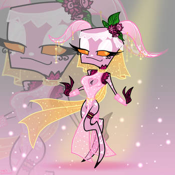
Xena reference, just because I felt like it and it's also easier to have the colors settled now for the comic. x'D I like her more now, seeing her colorsheme. I should've added the details about her arm devices and swords but I got lazy again. Eeehee. ~
I actually only need this character for my comic so she is more like a background character. :U
Zim's there for height comparison, Xena is about an avarage human height I guess. The tallest would be about 2 meter or more and Zim's just a little shit. Which is one of the many reasons I love him though. x'D
Please take note the information on this reference sheet is in the past. Zim's an elite and 15 years old etc.
It feels like I wanted to say more but idk anymore and I'm getting tired bye.
Xena © *Yommii
Zim © Jhonen Vasquez / Nickelodeon
Aaaah. Inactivity cured nao, lmao.
Xena reference, just because I felt like it and it's also easier to have the colors settled now for the comic. x'D I like her more now, seeing her colorsheme. I should've added the details about her arm devices and swords but I got lazy again. Eeehee. ~
I actually only need this character for my comic so she is more like a background character. :U
Zim's there for height comparison, Xena is about an avarage human height I guess. The tallest would be about 2 meter or more and Zim's just a little shit. Which is one of the many reasons I love him though. x'D
Please take note the information on this reference sheet is in the past. Zim's an elite and 15 years old etc.
It feels like I wanted to say more but idk anymore and I'm getting tired bye.
Xena © *Yommii
Zim © Jhonen Vasquez / Nickelodeon
Image size
1480x1390px 1.39 MB
© 2013 - 2024 oMellopi
Comments41
Join the community to add your comment. Already a deviant? Log In
This is a very well thought out character bio/description. 5 stars on originality for all the details as well as the creation of the costume and overall character design.
The layout of the Bio is a well executed computer schematic template. The codes and shapes in the background work well to give off this effect as well as the 'CLOSE TAB' options on the board. The only downside is the size of the writing. It is so samll and a very light color similar to the background thus it is difficult to read. 4 stars for Vision.
Your effects on making the armor, the details, shading, and shines, are all focused on one light source giving the whole character the intended 3-D effect. Some of the lines, like the darkness of the arms and the lines of the antennae, are a bit thin, and, the left arm in particular, is hard to make out against the black of the cape. However since those thinner lines match with the whole feel of the character I'll give a 4.5 for Technique.
As far as character bio's go, this one is much more thorough than most. The added details really make it seem like this is a subject report on some government computer. I'll give a 3.5 for Impact, because even if it's well done, a character bio is still a character bio.
Overall I do love this image. The artists style is very clearly seen in not only the costume design, but also in the eye, antennae, body, and head shape. Personally my favorite part is the two gauntlets, and the way the light shines off those pink panels, as well as the Irken Instructor symbol, which I don't think I've ever seen before and may end up borrowing because it's very cool.